Fewer pages, a shorter route to an enquiry

Client MSP Capital

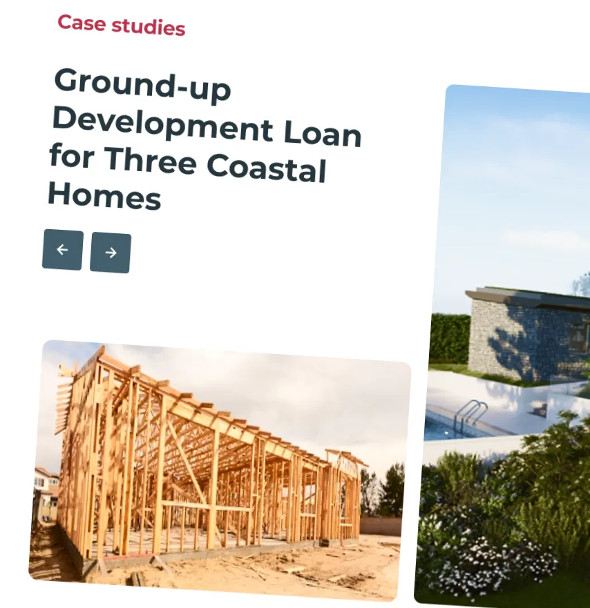
property developer builders on site

Project summary

MSP Capital’s old site had built up pages over the years, and the information required by users to make a decision was spread across several of them. Each extra page was another click, and therefore friction between arriving and getting in touch.

The brief was a brand new design. The job underneath it was to shorten that distance, without losing anything a visitor came looking for.

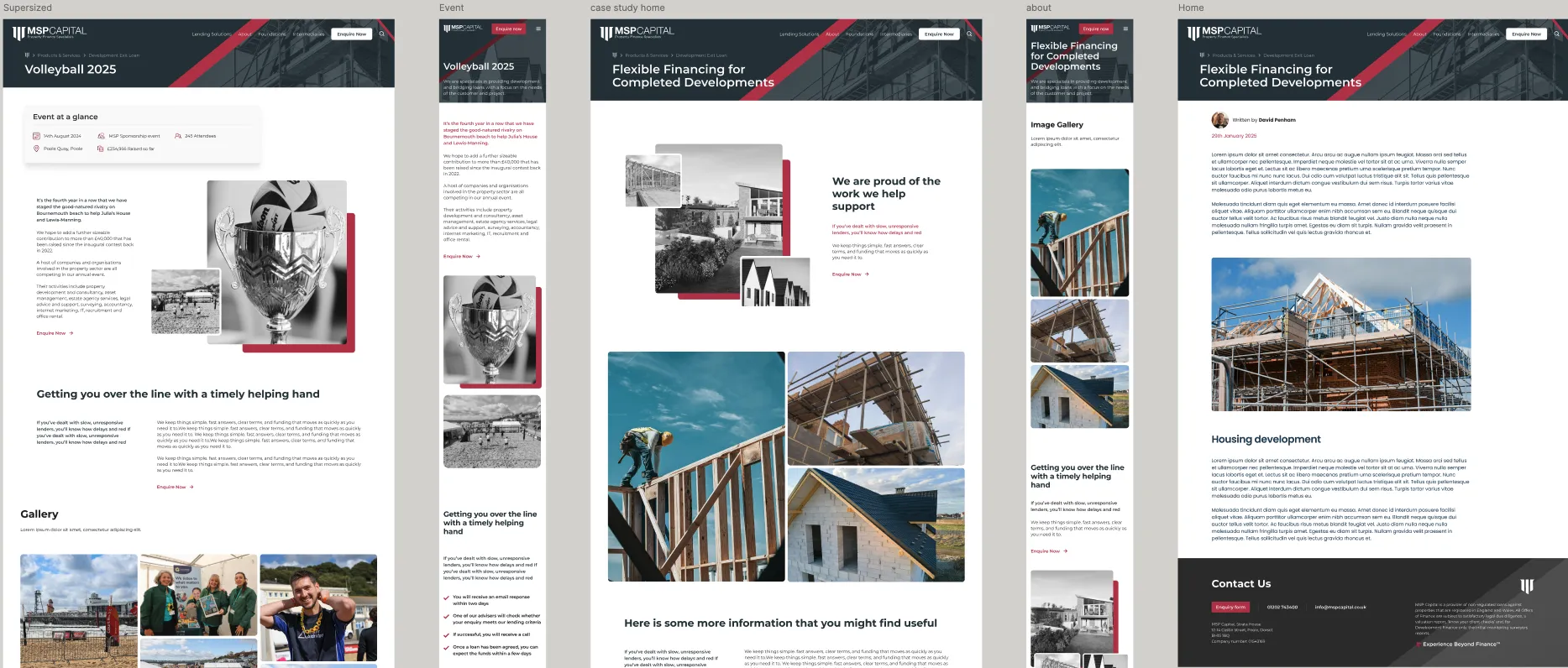
MSP logo background UX UI component for case study

Cutting pages without cutting answers

Consolidating a site is typically a trade. Fewer pages means fewer steps, but take out too much and people can’t find what they need. Move it carelessly and you lose rankings those pages spent years earning.

So we worked through the sitemap page by page with MSP Capital’s team: what each page was for, what it answered, and where that answer should live now. Where several pages were doing one job, we merged them.

To carry more on a single page without it turning into a wall of text, we built custom content blocks for the new layouts. A visitor can scan a page for the one answer they need, and the next step is always in view.

UX component design

What we did

Design. We went through several design directions with MSP Capital until both teams felt the site sounded and looked like them. Photography and animation were chosen to support the message rather than decorate it.

Content. Pages whose route through the site had changed were rewritten, not just moved. Content that still worked came across from the old site as it was.

Build. The site runs on Uprated’s own theme, so the technical groundwork was in place from day one: clean templates, mobile-first layouts, and accessibility. Faster pages matter most on mobile, where most people give up on a slow load before they’ve read anything.

Measurement. GA4 event tracking went in with the build rather than after it. That means MSP Capital can see which pages lead to an enquiry and where people stop, and the next round of changes can be based on that rather than opinion.


What changed?

Enquiry conversion. Change in enquiry conversion rate since launch. Fewer pages between landing and the enquiry form was the main aim of the restructure.

Design. The new design has been received really positively by both MSP’s team and their existing clients.

Page speed. The new theme was built with load time as a target, not a check at the end. When the site launched we had 99/100 page speed

Thomas Hewitt

“ What our team said…

The great thing about working with the team at MSP Capital, is how they combined with our own team to help generate and grow the vision of the website. Things like animations and photography all came together to create a beautiful site that we can all be proud of.

Thomas Hewitt – Senior Web Developer